one brand, two markets
four years of identity, film and bilingual media for an enterprise ai company built between islamabad and beijing.
we built isbei a visual system that had to work in english and chinese at the same time, then kept it running for four years while the company scaled from pilot to enterprise deployment. the same rules now hold across a website, an investor film, a launch campaign and a bilingual social pipeline.
the name is the brief
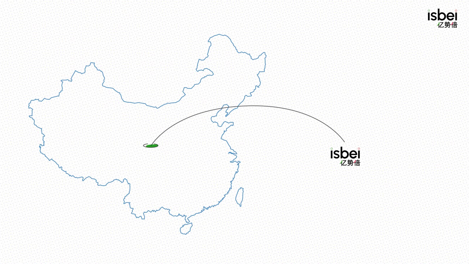
isbei is islamabad and beijing compressed into one word. the company anchors pakistan's engineering to china's market, and the brand had to hold in two writing systems from the first sketch rather than be translated at the end of the process.
the practical problem was that nothing accumulated. there was a name, a technology, and a run of decks that each looked like a different company. every new piece was rebuilt by hand, so four years of output would have produced four years of drift instead of four years of equity.
so we designed the system in both languages at once, and made everything else inherit from it.
from a phase one guide to a working system
the 2022 book set a name, a logo and five colours. four years later the guide specifies motion, writing style and the exact ground everything sits on.
- a logo, a primary palette and a first typographic rule
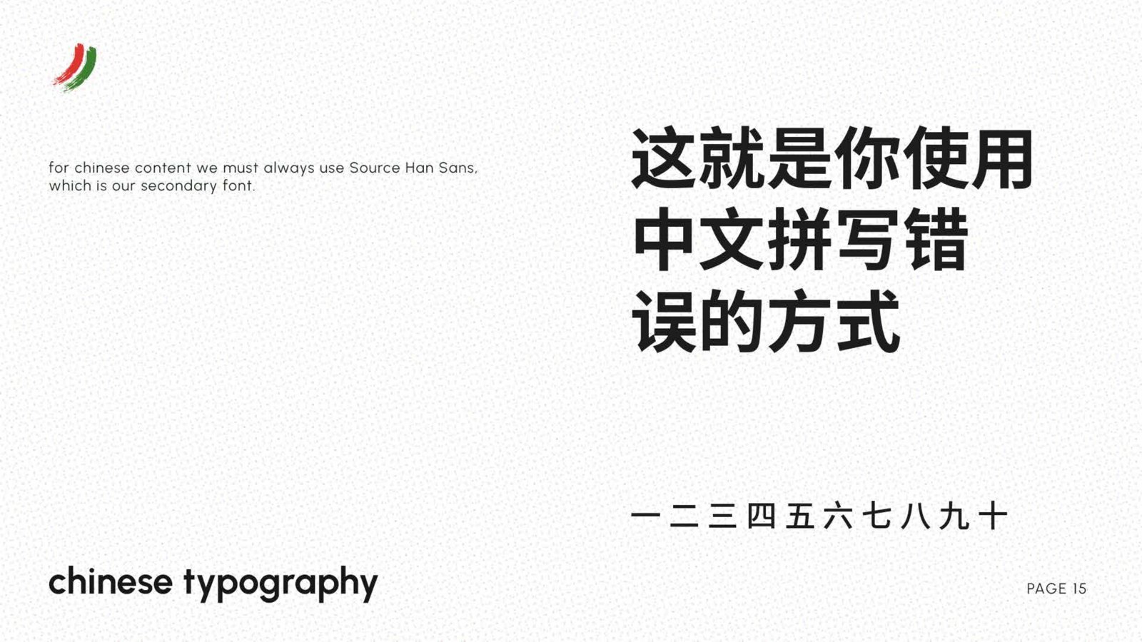
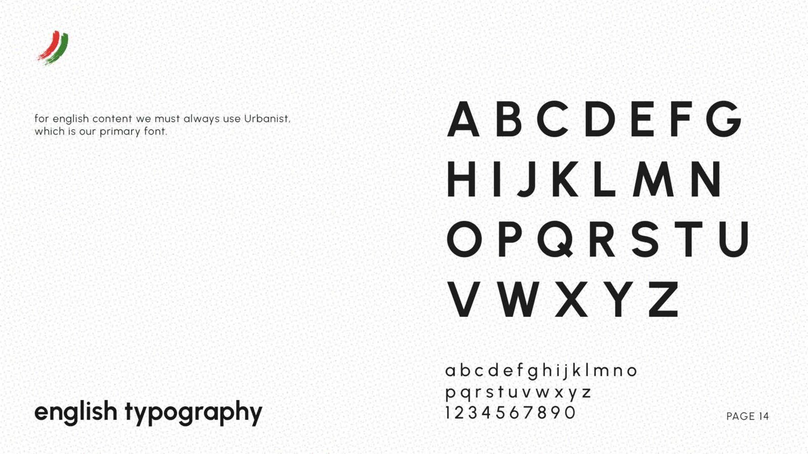
- urbanist named for english, source han sans for chinese
- the secondary font page still reads placeholder
- the secondary palette repeats one red four times, unfinished
- social guidance is a single line, only wechat for now
- one named ground, dotted paper, with three neutral fills
- two colour registers, saturated for meaning, brush for calm
- every shape built from a circle, no corners anywhere
- a writing style, lowercase always, one keyword coloured per line
- motion rules, nothing snaps, four second holds, grain over everything
identity and web infrastructure
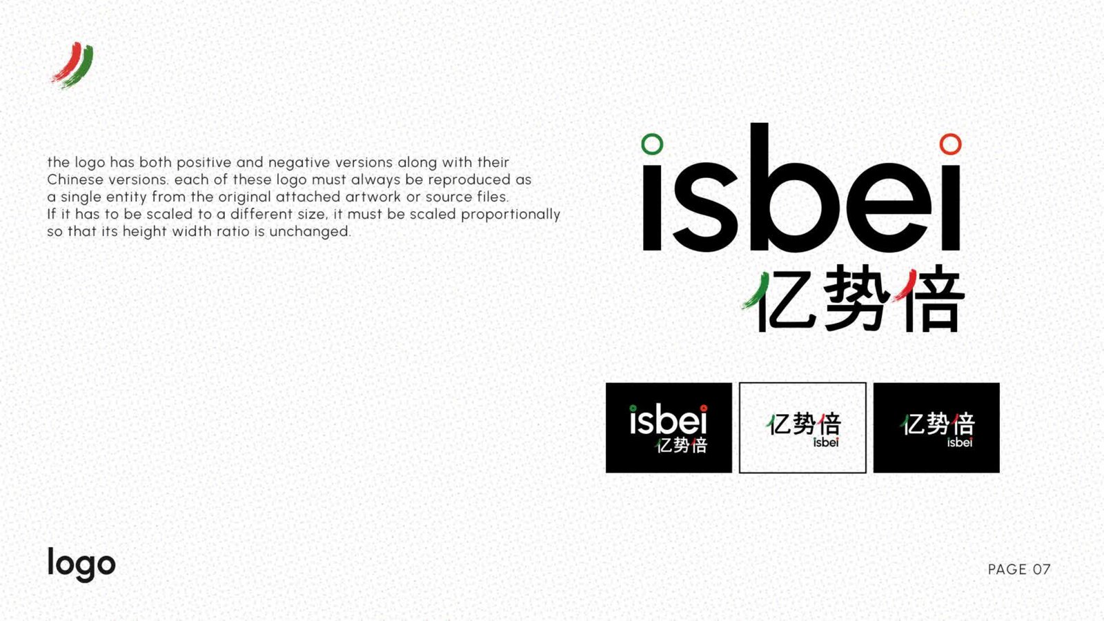
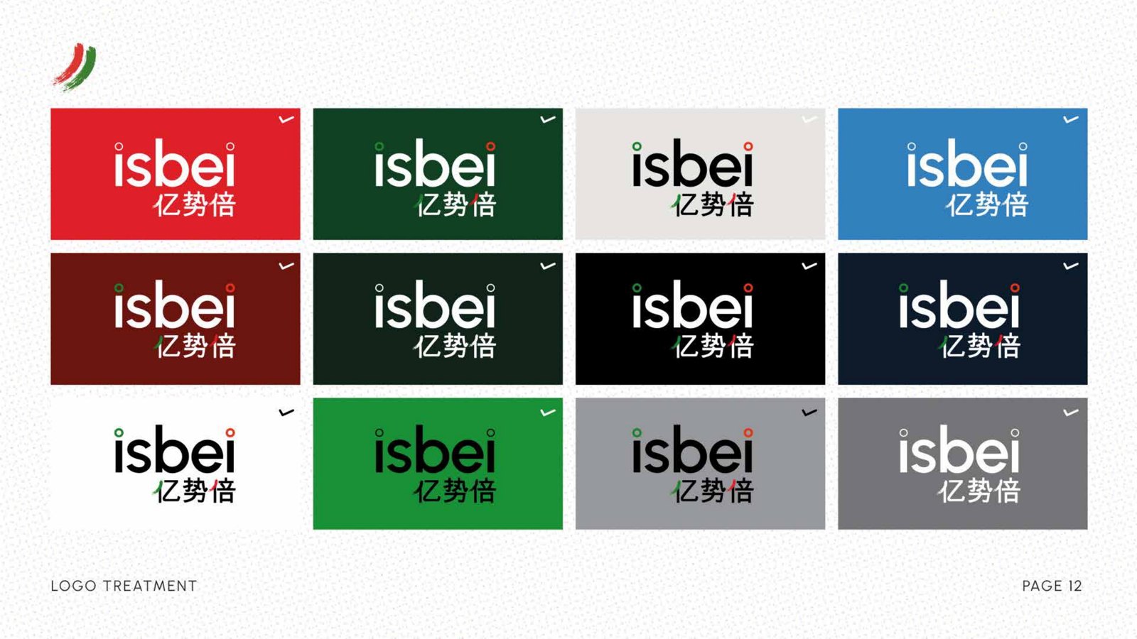
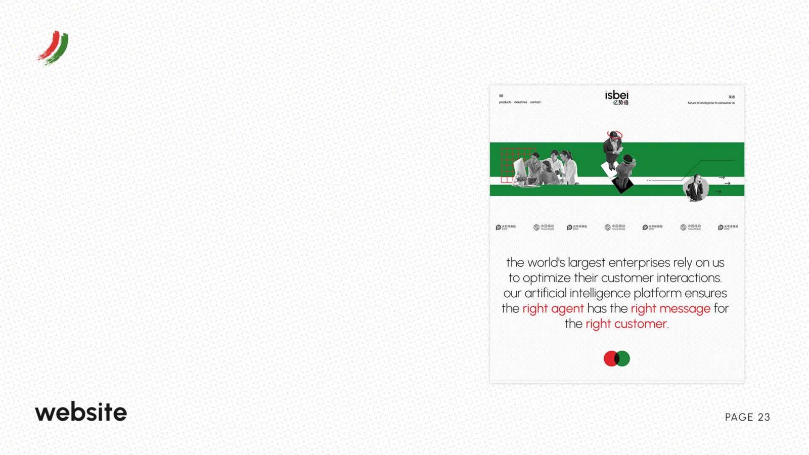
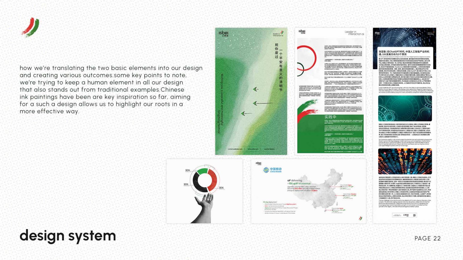
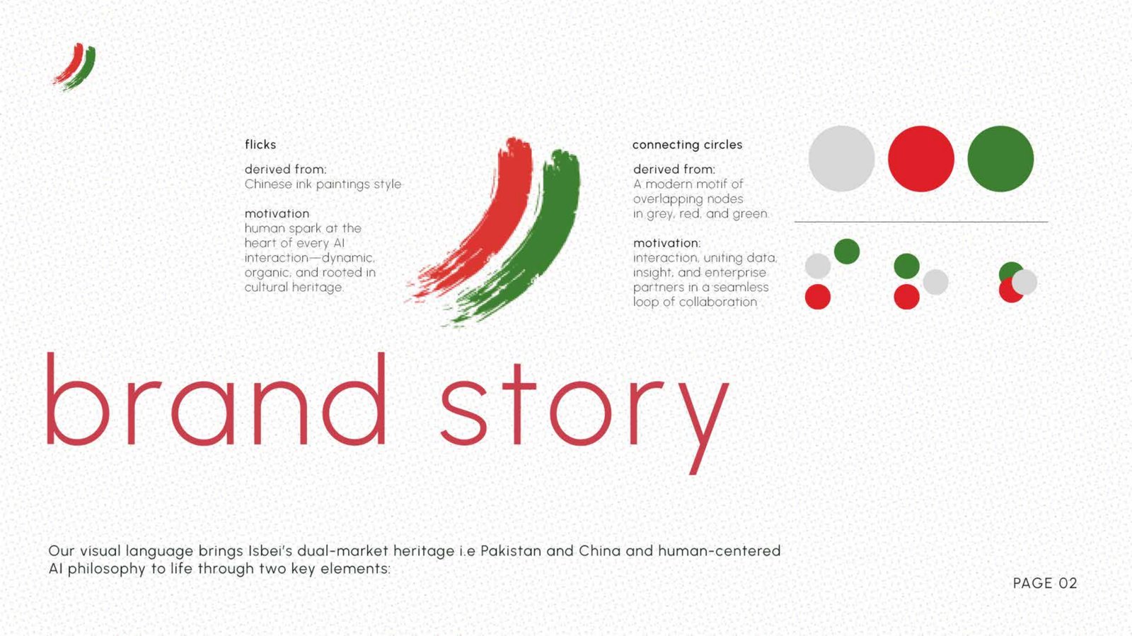
the identity resolves to two elements that do the same job in either script. flicks drawn from chinese ink painting carry the human side. connecting circles map the customer journey from insight through pairing to optimisation. urbanist sets the english, source han sans sets the chinese, both to one hierarchy, so a layout changes language without being redrawn.
film and motion engine
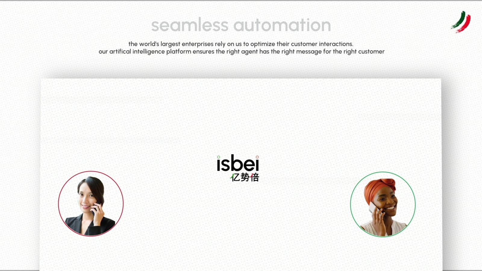
the identity had to move before it meant anything to an enterprise buyer. the motion language is built on the same circles: dots settle, rings draw on, oversized soft forms drift behind the type. nothing snaps, every beat holds about four seconds, and a fine grain ties the digital shapes back to the paper.
from wechat to worldwide
the 2022 guide had one line about social, only wechat for now, and a rule to china proof every post. in may 2026 isbei opened on linkedin with a six post launch, one film per post, produced in english and chinese from a single brief. the channel count grew, the system did not have to change to carry it.