a voice, made visible
brand identity, website and product design for convoa, an ai voice assistant that answers the phone for service businesses, books the job and follows up.
convoa answers inbound and outbound calls around the clock for dental practices, heating firms, law offices and other service businesses. we built the brand from the name outwards: a wordmark with three dots that move like a voice, a website that explains the product before a visitor scrolls, and a dashboard where an owner can see every call, brief every agent and plan the day’s jobs.
a product you never see working
an ai voice assistant works out of sight. the calls happen while the owner is on a job or with a patient, so the brand has to earn trust before the first call and the dashboard has to keep it after every one.
the buyers are not technical. they run a dental practice, a heating firm, an accountancy. the website had to make round the clock call handling feel simple and safe in one screen, and the product had to read without a manual.
and it all had to look like one company: the same colour, the same type and the same three dots, from the logo to the login screen to the last setting.
the voice does the work. the brand is how people learn to trust it.
three dots that speak
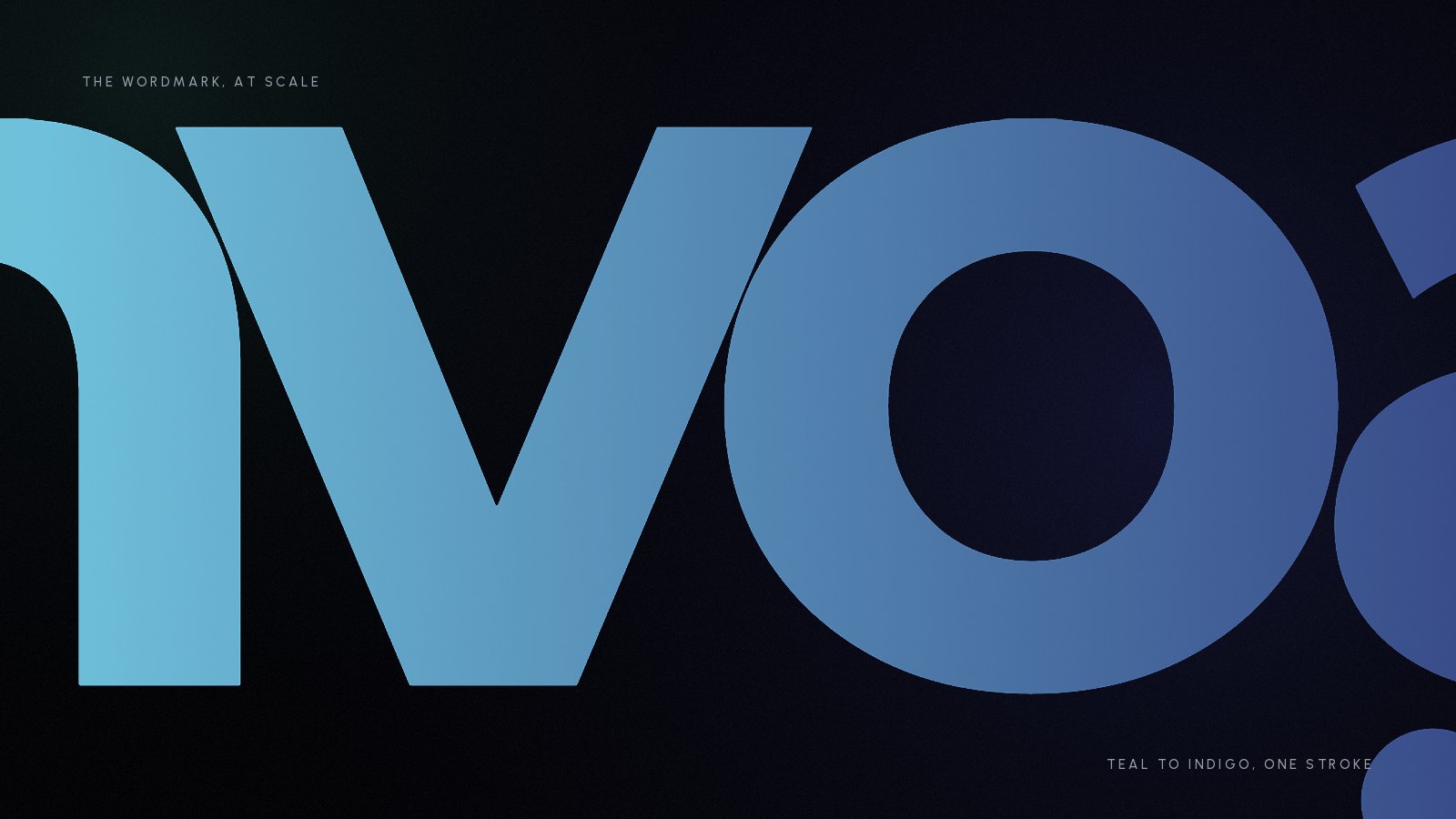
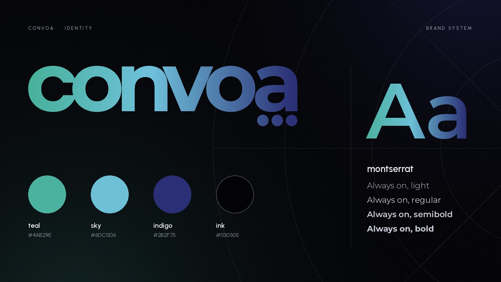
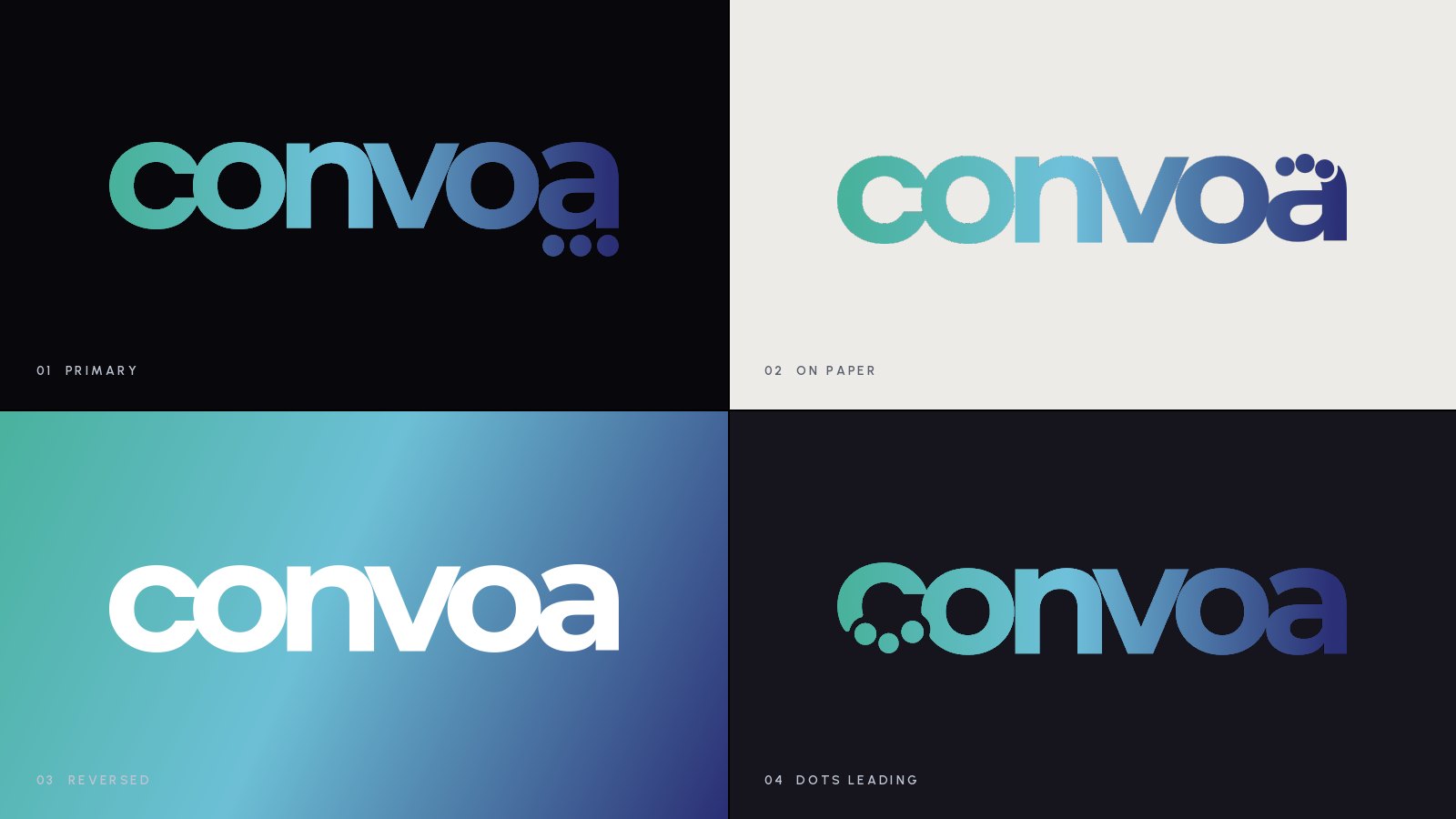
the wordmark is set in a rounded geometric sans and runs teal to indigo in a single stroke. three dots sit with it and change position across the system, so the mark reads as something listening rather than a badge. the palette is four colours, teal, sky, indigo and an almost black ink, with montserrat carrying everything from the headline to the smallest label.
the site goes first
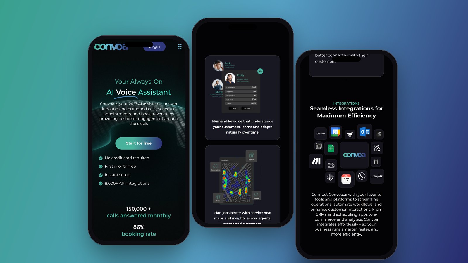
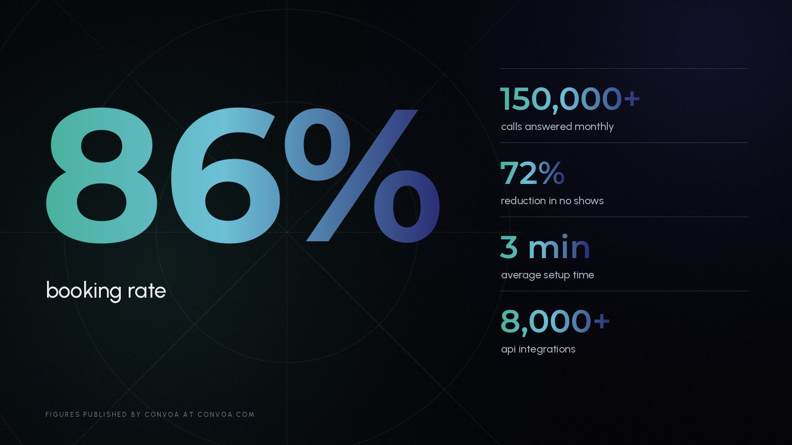
the site leads with the promise and the proof together: an always on assistant, then the numbers convoa can stand behind. below it the product is shown in pieces rather than as one screenshot, a voice ring invites a visitor to talk to it, and every industry gets its own page, from dental practices to injury lawyers. it was built for the phone first, because that is where most owners meet it.
the calls, made visible
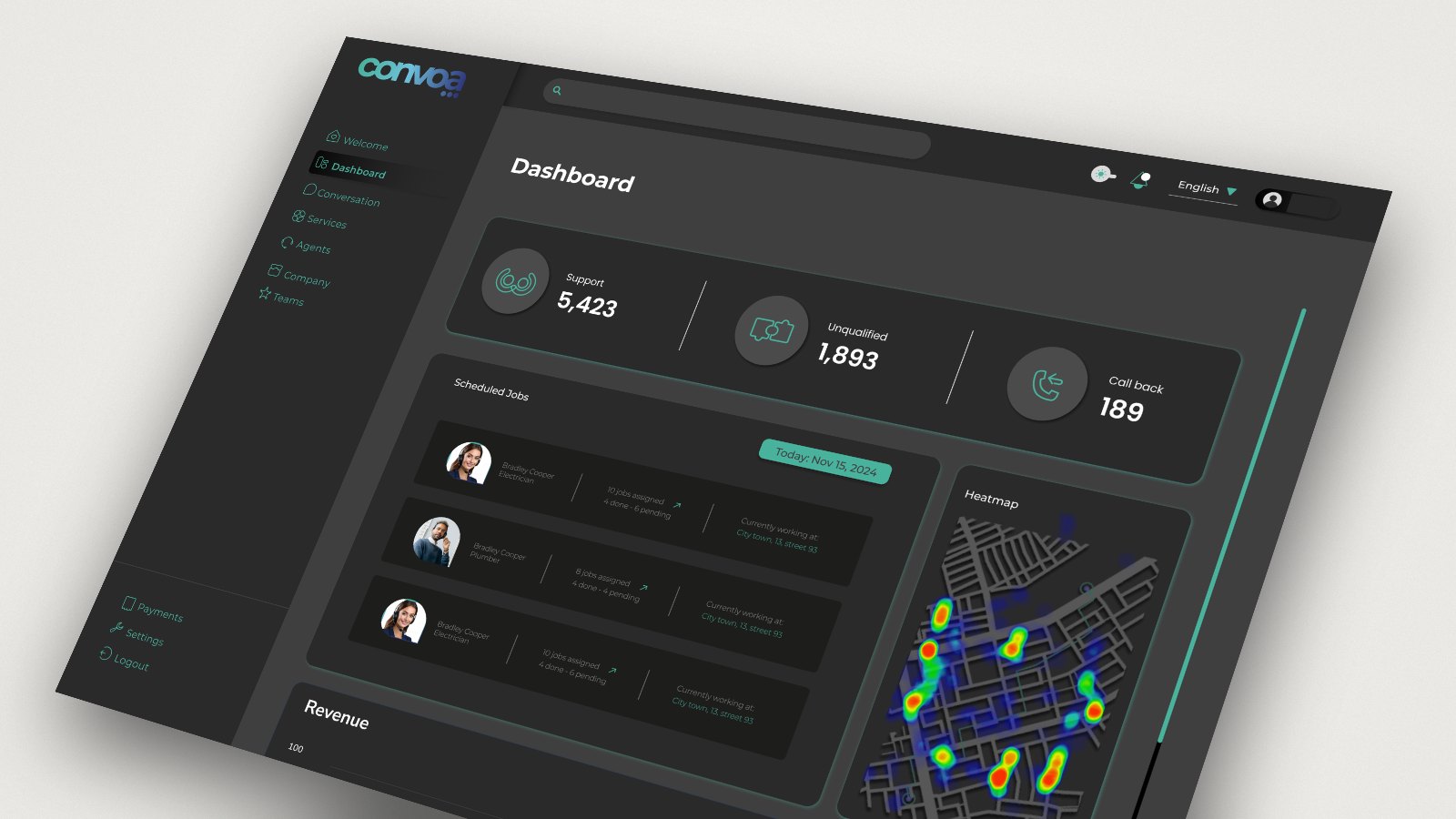
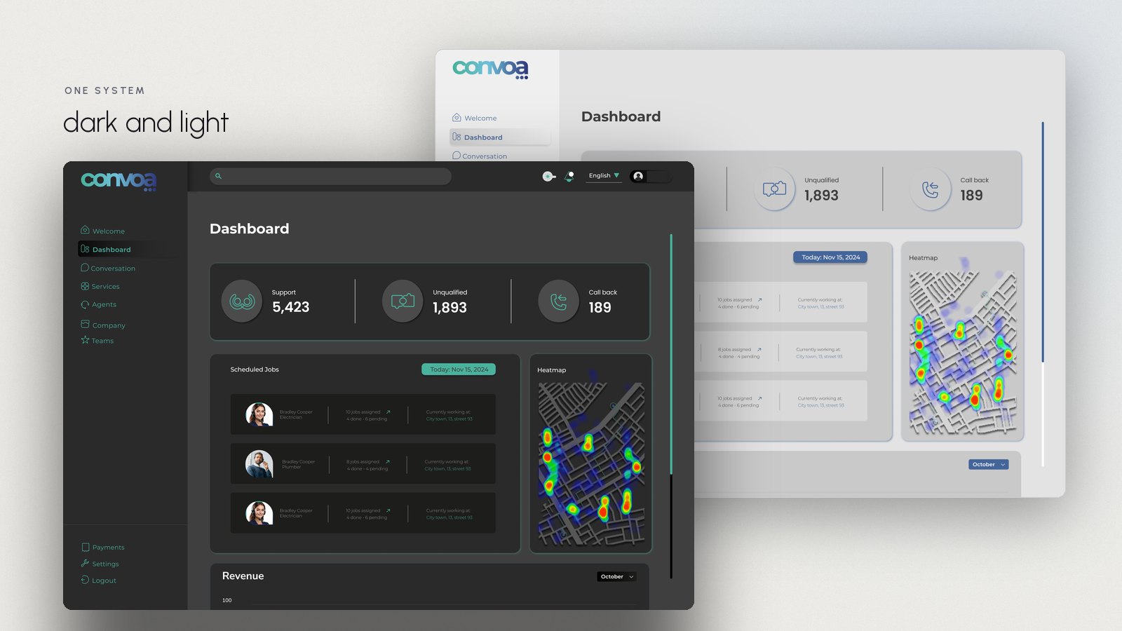
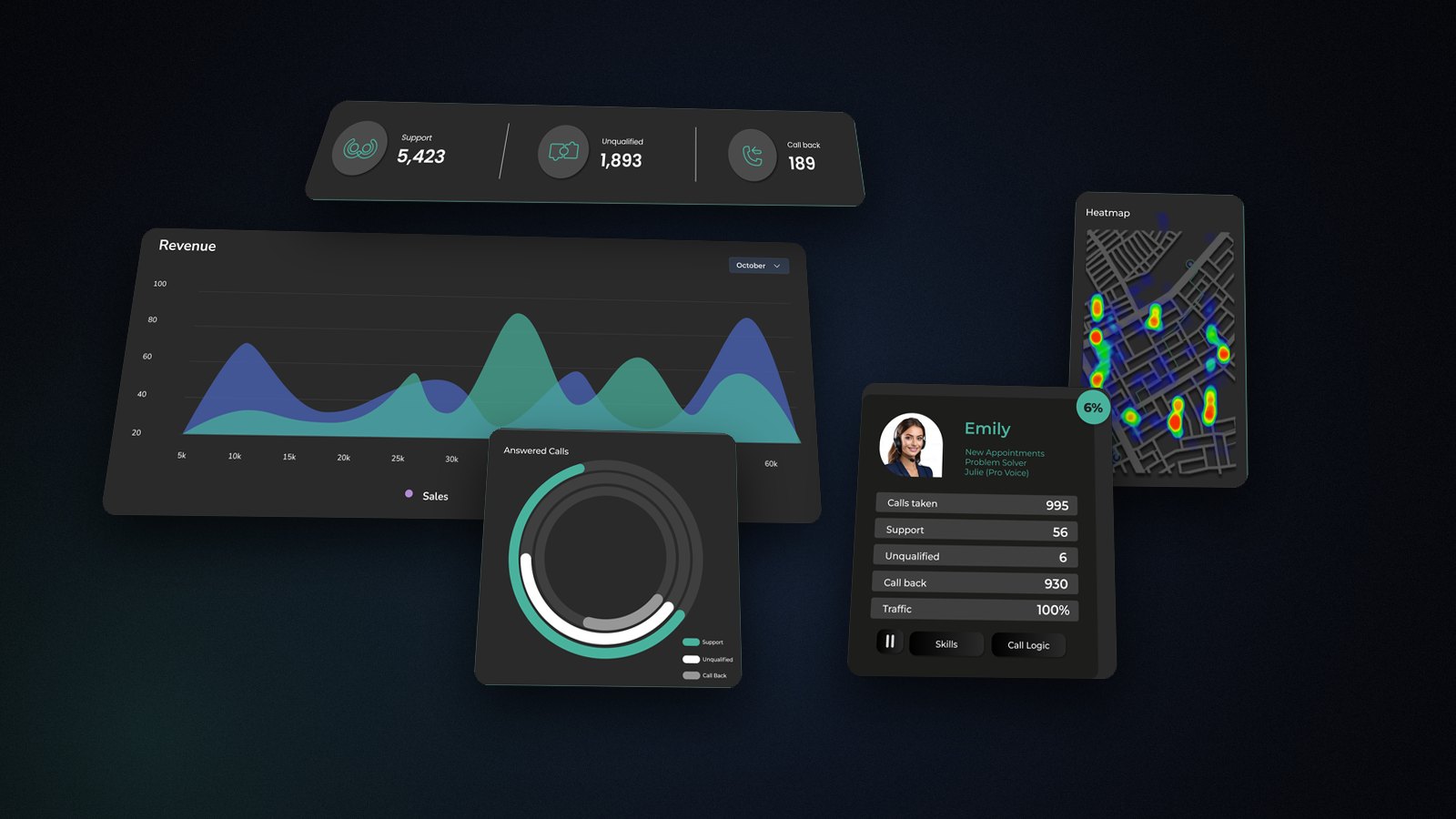
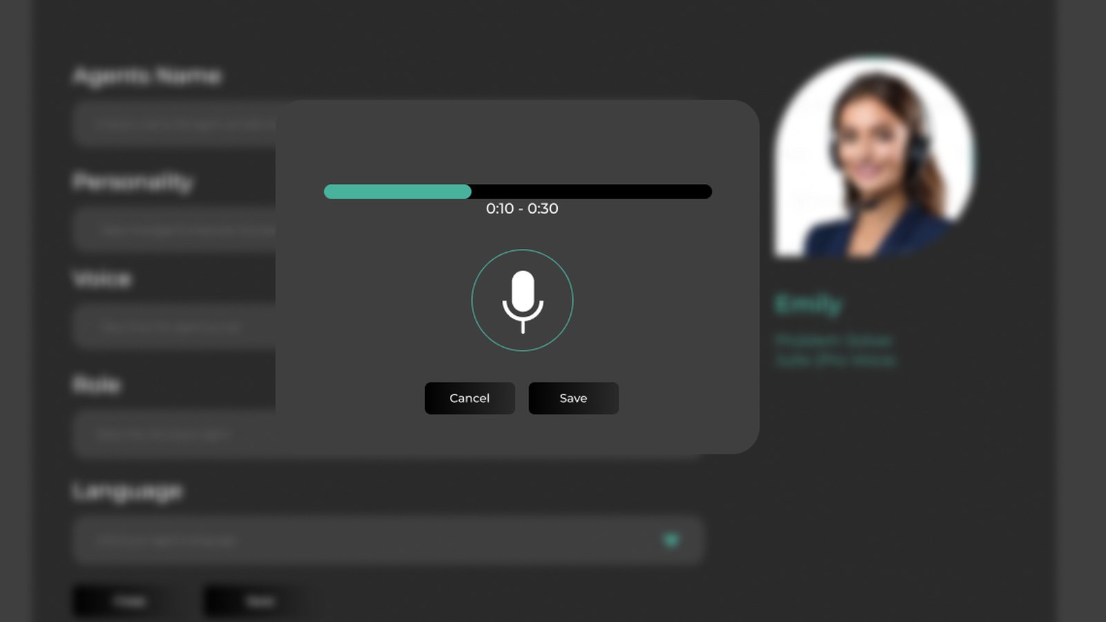
the dashboard opens on three counts, support, unqualified and call back, with today’s booked jobs and a heatmap of where the work is. each ai agent has a face, a name and a voice, and can be briefed in plain language or given a voice from a thirty second recording. call logic turns a conversation into steps an owner can switch on or off, and every call keeps its transcript, summary and location. as one convoa customer puts it, “for the first time, i can see exactly what is happening on every call.”
one system, every surface
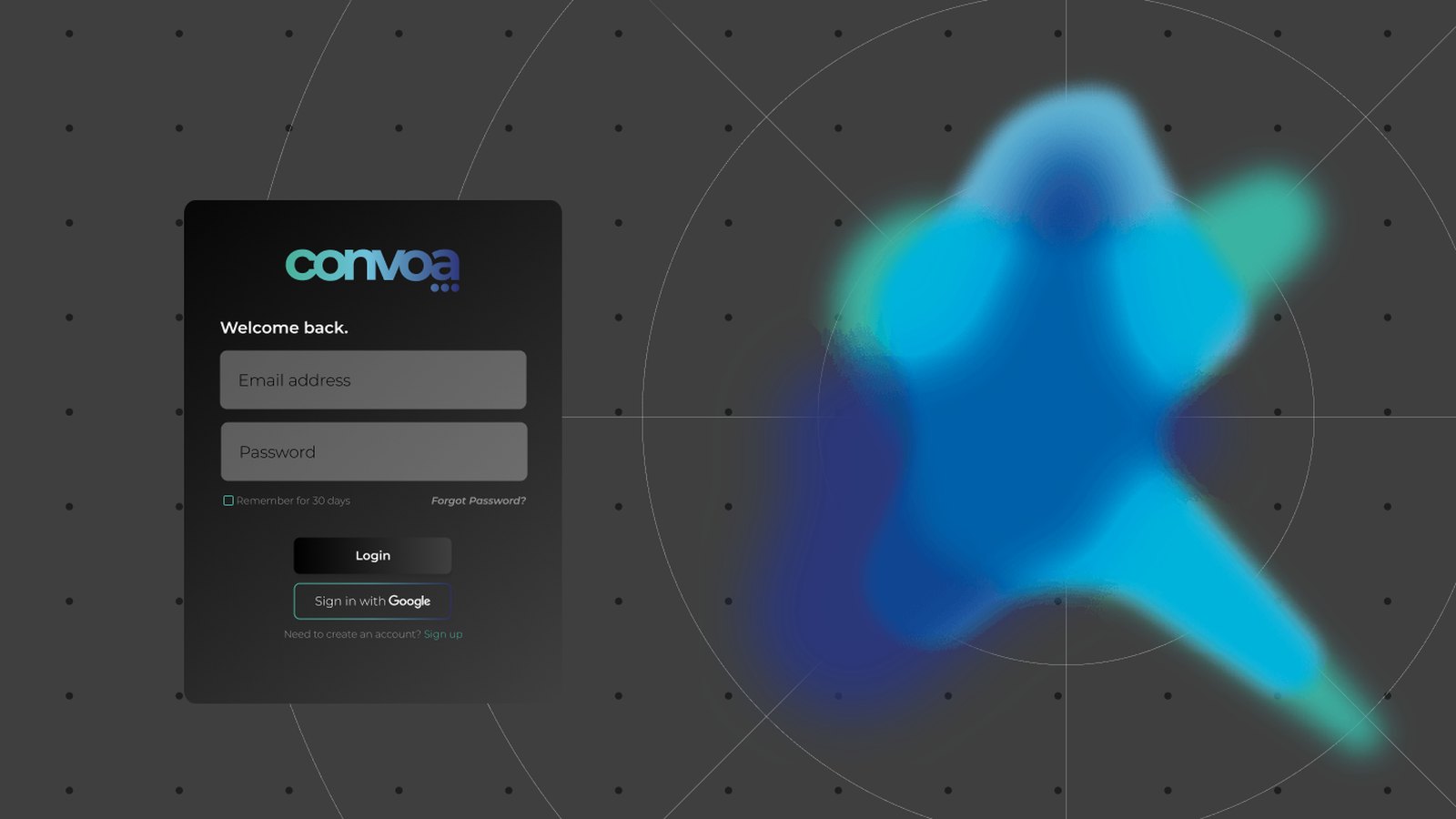
the same gradient, type and dots run from the wordmark through the login, the loading screen and every page of the product, in a dark and a light theme built from the same parts. over two hundred screens and states were designed and handed over as clickable prototypes, so convoa’s developers could build without guessing.